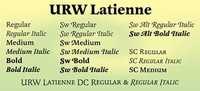
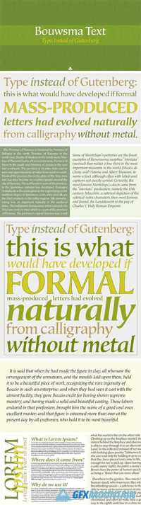
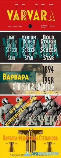
Normative Pro Font Family

Normative Pro Font Family

Normative Pro Font Family
12 OTF
Normative Pro is a sans-serif font family that includes a 12 styles (6 weight and italics), supports Latin, Cyrillic, Greek, Eastern European, Baltic and Turkish scripts. The family uses a large number of useful Open Type features: small caps, contextual alternatives, stylistic alternates, fractions, proportional and tabular figures and more. Normative Pro is a font with a wide sphere of application, legible from very small sizes to very large ones. Can be used both in technical documentation, office work, business communication, as well as in advertising, visual communication, magazines and posters, in branding and packaging.
Read more

Studio Sans Font Family

Studio Sans Font Family

Studio Sans Font Family
6 OTF
StudioSans — is a modern representative of the class of sans-serif fonts inspired by the traditional Swiss design and typography of the mid 20th century. This is a minimal, clean and open font family with friendly forms. Focuses on functionality, has a high x-height and short ascender and descender elements. This is combined with soft circles and high legibility of characters contributing to comfortable reading. The family contains six weights from ExtraLight to ExtraBold. Each of them has in its arsenal more than 450 glyphs and knows more than 50 languages. Support for OpenType Features focused on the Old style Figures (including signs of currencies and interest), Case-Sensitive Forms, Standards and Discretionary Ligatures, Slashed Zero and Etc.
Read more

Screen Sans Font Family

Screen Sans Font Family

Screen Sans Font Family
14 OTF
Screen Sans is a large family of constructed-style sans serif fonts. These fonts feature forms that look like those that have been favored by engineers for over a century. Their letters are straight-sided, and the strokes that make them up are monolinear. The Screen Sans family includes 14 members. Seven of these fonts are italics, although these italic fonts should really be called ‘obliques,’ as the letters are slanted versions of what you’ll find in the upright fonts. The family’s weights range from Extralight through Extrabold. The x-height is moderate, so the ascenders and the descenders are quite prominent. The ascenders rise above the capital letters and the numerals – both of which share the same height. Each font uses a double-storey ‘a’ and single-storey ‘g’. Years ago, fonts like Screen Sans were primarily used to brand firms in engineering and tech. Recently, however, they have become increasingly popular solutions for setting text on screen. The Regular weight of this family would be excellent for setting body copy either on screen or in print. The other weights can be used for text sizes, too, but will function even better when used large. Screen Sans was designed by Jeremie Hornus and Ilya Naumoff.
Read more

Dunbar Font Family

Dunbar Font Family

Dunbar Font Family

The idea for Dunbar came up in a conversation with Indra Kupferschmid in early 2015 about iconic sans serifs and the original metal version of Erbar-Grotesk. And in a way, it stayed a conversation, with the typeface. Dunbar is not a strict revival of Erbar. It is inspired by its design but just as much by its concept of variations and alternates in form and proportion that seemed just made for today’s type technology and easy implementation in OpenType. Jakob Erbar was ahead of his time devising a desire for, and offering different sets and alternate glyphs that can very drastically change the character of the whole typeface.
Read more

Artigo Pro Font Family

Artigo Pro Font Family

Artigo Pro Font Family
Artigo is an old style inspired typeface system for text. It was inspired by the handwriting aspect of the first roman types but it intends to be a contemporary interpretation. Its abilities are in small text with personality. The italics capture a lot of its dynamic feeling even more expressive on the display version that stands as the most handwritten one. This project started at the University of Reading while attending the MA Typeface Design in 2011.
Read more

Frauen Font Family

Frauen Font Family

Frauen Font Family
Frauen is Lucas Sharp’s ode to German calligraphy. The script style is based on lettering Lucas found on the cover of an almanac of Berlin debutantes published in 1945 titled, Die schonsten Frauen der Welt: The Most Beautiful Women in the World.
Read more

Bazaruto Decorative Family 331065

Bazaruto Decorative Family 331065

Bazaruto Decorative Family 331065
2 OTF 2 TTF | 317 KB RAR
The Bazaruto Decorative family was inspired by an old fashioned specimen from “Letters and Lettering” by Carlyle & Oring, but you'll find the inspiration has been greatly expanded upon. What began as an all Capitals letterset has been fleshed out to an extended full character (Capitals & Small Caps) set with many features and variants from the original design.
Read more

FS Olivia Font Family

FS Olivia Font Family

FS Olivia Font Family

On a visit to Belgium and the Netherlands while still an MA student at Reading University, Eleni Beveratou made some important discoveries. First, there was the letter ‘g’ from the Didot family seen at Plantin Moretus Museum in Antwerp, which seemed “almost like a mistake”. Then there were strange details such as the serifs on the “l”, “h”, “k”, “b” ?and “d” in Egmont Cursive and other typefaces by Sjoerk Hendrik de Roos, found in volumes of poetry she picked up from a chaotic bookshop in Amsterdam. These were characters that stood out from the text but seemed to blend harmoniously with the rest ?of the letters. “And there it was, the spark. ?I decided to design a typeface that would capture the details of the process of writing.”
Read more

FS Albert Narrow Font Family

FS Albert Narrow Font Family

FS Albert Narrow Font Family

FS Albert Narrow is a narrow version of FS Albert Pro, designed by Jason Smith. But, drawn from scratch, it’s more like a font in its own right, as Jason Smith explains. “The challenge in designing a narrow version of a typeface based on an existing design is not to make it to look squashed. “There comes a point in condensing a font where it becomes broken. You can usually automatically squash something by 10% and it will still look OK. But by the time you’ve squashed it by 25% the type looks ugly and needs redrawing. So we drew it all manually in order to ensure the design integrity was kept while still fulfilling the need to save space.”
Read more