Metropolis CT Font Family
Metropolis CT Font Family

Metropolis CT Font Family
2 TTF
Metropolis Bold was commissioned by Publish magazine for their 1990 redesign. Although other digital versions exist, I think this was the first one and is characterized by extremely pointy serifs. It is well to remember in laying out copy for Metropolis to allow plenty of white space in the layout. Metropolis is based on the 1932 Stempel cut as designed by W. Schwerdtner.

Read more

Taberna Font Family

Taberna Font Family

Taberna Font Family
22 TTF
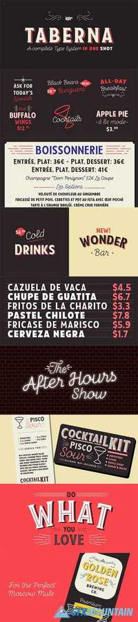
Taberna is a type system that provides a wide range of choices for any design project. The typeface comes in Sans and Serif layered versions plus a monolinear Script font.Taberna is the result of having explored design trends in bar signage, liquor packaging and street wear. Taberna is a funny display font with a Sans version—that provides a more clean and simple design—and a Serif one, which gives text a more distinctive and sombre personality. The Script version matches perfectly with the heavy Caps of the typeface. Taberna is a very versatile font well-suited for headlines, posters, logotypes, etc.
Read more

FF Carina Font Family

FF Carina Font Family

3 TTF
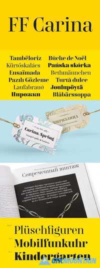
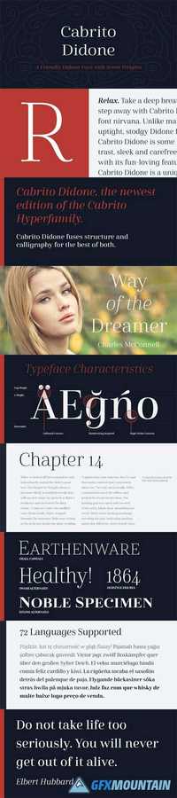
Drawing inspiration from 18th and 19th century Modern serif types, FF Carina is a high-contrast typeface for display and short texts. Its round letter forms with slightly narrow proportions are derived from writing with the pointed pen. Stylish details, an extended ligature set, and ornamental swashes lend the typeface an elegant and refined appearance. The most striking feature of FF Carina is the sophisticated Cyrillic glyph set with numerous swashes and ligatures, created by a native Russian designer.
Read more

Winner Font Family

Winner Font Family

47 TTF
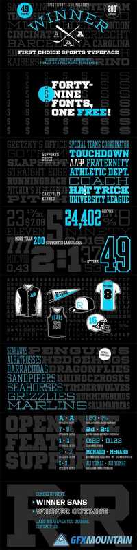
Winner—Classic athletic aesthetics, finally as a versatile contemporary font family. Just when you thought there was nothing left to add to the classic sports design, we lifted it to a whole new level. Whatever you want to set in whatever space, with seven weights in seven widths, you’ll definitely find the right proportions for it! Winner supports not only most Latin-based languages but also Greek. Its extensive character set also contains currency signs, arrows, as well as a wide range of numerals from small figures to Roman numerals. Furthermore, its sophisticated OpenType layout features give you access to alternative letter shapes, fractions, tabular figures, and contextual alternates. With more than 24,000 glyphs in 49 fonts, Winner leaves nothing to be desired. Grab Condensed Regular for free and give it a spin!
Read more

Navigator Font Family

Navigator Font Family

5 TTF
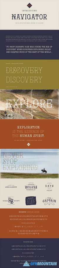
The Navigator family is inspired by the early explorers, the early sailors with their old-style tattoos and the cowboys in the old west. I mashed up these to styles to create the Navigator display family. It has a vintage feel with a more modern day approach.Use the regular styles to give your artwork a more clean look and feel or the rough styles to take on the more vintage old-style. This family is great for display use on posters, packaging, editorial and logos. It is created with the designer in mind to have some fun and mix up some great looking Upper / Lower case combinations. The Navigator hand font is an informal, rounded sans-serif that works perfectly with the Navigator display fonts to create beautiful logo and type lockups.
Read more

Ultine Font Family

Ultine Font Family

42 TTF
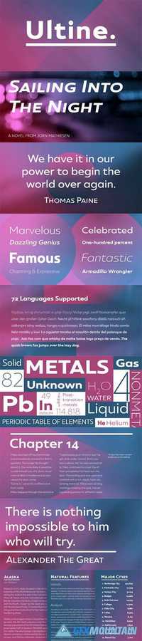
No frills. No fluff. Still friendly. Keep your look clean and simple with the utilitarian but gentle Ultine. This font with a slightly extended geometric architecture gets straight to the point without pushing your reader away with too firm an approach.Ultine covers a large set of multi-Latin languages. It includes a wide range of other OpenType features, too, including ligatures and contextual alternates. Moreover, small caps of Utline and titling alternates are available for deepening your design capabilities with this basic face.The Ultine family consists of 42 fonts with three different widths and italics counterparts for every style. The design is well suited for graphic design and any use of the screen. It can easily operate as a webfont, as text for banner ads and for branding as well as editorial design. And just to show you how simple and friendly the font can be, the regular weight is free, so you can use it to your heart’s content.
Read more

Normatica Font Family

Normatica Font Family

Normatica Font Family
24 TTF
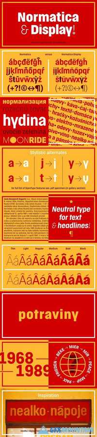
Normatica is a neutral typeface inspired by advertising letters used as letterings on shop windows during period of Normalization (the 60s–90s) in former Czechoslovakia. The complete font family consist of 24 styles in 6 weights (Thin–Black) with matching Italics where every style is followed by his Display counterpart. The difference between default and display styles is tighter spacing in Display fonts and different design of punctuation and diacritics accents. Beside the complete set of Latin, Normatica includes Cyrillic characters as well. Each font contains of alternative variation of some characters (j, t, y, Q) and includes a wide range of the Opentype features (for more details see pdf Specimen in Gallery section). Mixture of Normatica and Normatica Display can be effectively used for both text and display usage. It can be used in advertising, signage, corporate identities and various situations of editorial design. You can try two Demo styles in Medium weight fully for free.
Read more

Bw Modelica Expanded Font Family

Bw Modelica Expanded Font Family

Bw Modelica Expanded Font Family
48 TTF
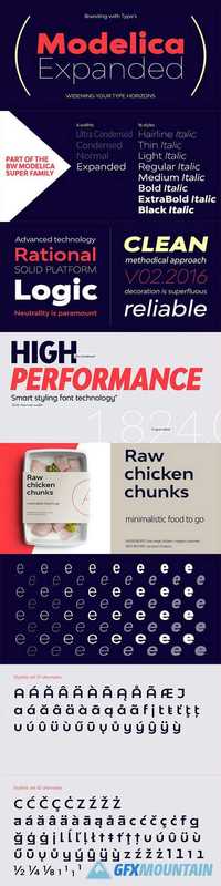
Designed by Alberto Romanos, Bw Modelica is a minimal, robust, reliable & pragmatic geometric sans. Its clean shapes and generous x-height makes it a very competent face for both, display and body copy purposes.It’s available in four widths, each containing eight weights with matching oblique italics (that’s 64 styles in total). The main font files include two stylistic sets allowing for more expressive options, specially for display use.SS01 and SS02 are also available as stand-alone font files, for those who would prefer to use them directly without activating the OpenType feature.
Read more

Aubusson Font Family

Aubusson Font Family

Aubusson Font Family
7 TTF
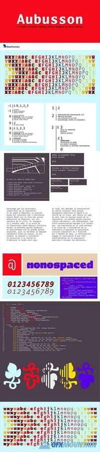
Aubusson is a monospaced typeface with a heart: binding together a mechanical feel and a very sensitive design. Initially designed as a custom typeface by Franck Jalleau for the Cite internationale de la tapisserie d’Aubusson, the monowidth proportions are linked to pattern and tiles arrangements used in tapestry. The retail version of Aubusson offers 4 weights with matching italics for a really versatile family efficient for identity, signage, short texts and display.
Read more

Hrot Font Family

Hrot Font Family

Hrot Font Family
18 TTF
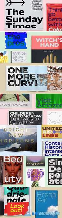
Grown organically from the soft aesthetics of Swiss and German airline posters, Hrot is a versatile sans-serif family with eighteen distinctive cuts. Works perfectly in elegant headlines and gives perfect impact to any logotype.All characters have wider drawing, which makes them pleasant to read in all sizes and works perfectly both in print and digital media. Sharp ended serifs are surprisingly combined with rounded shapes. Select thin or black style, whole structure just breathes air and radiates simplicity.Conclusion: when humanism meets geometry, the result is a unique personality. Hrot is the final proof.
Read more

Cherripops Font Family

Cherripops Font Family

Cherripops Font Family
20 TTF
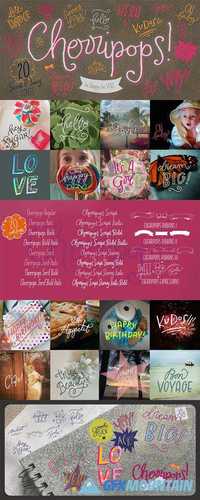
Be Happy, Be you! Express yourself with Cherripops, an OpenType family of 20 sweet & juicy fonts with plenty of cute options to have fun with.This beautiful family includes platyful handdrawn scripts, sans serifs, serifs and supercool ribbons & expressions to decorate your projects with a youthful flair to let that creative kid within shine!Perfect for quotes, t-shirts, book covers, posters, packaging projects, food, apparel, magazines and with such a wide variety of styles, Cherripops makes the perfect font system for film, television, marketing, advertising and websites.
Read more

Breul Grotesk Font Family

Breul Grotesk Font Family

Breul Grotesk Font Family
32 TTF
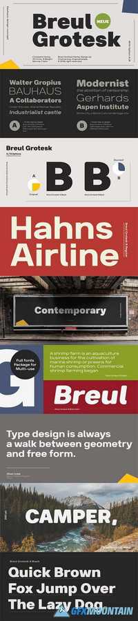
Taking inspiration from an attempt to marry art with industry of Bauhaus (1919), Brueul Grotesk is classic and straightforward, cutting back superfluous elements. A Sans Serif type, it’s like a design from the Machine Age. It comes in A and B sets to offer end variations—choose the bulbous terminals set if you need a less stern impression. It then is suitable for diverse demands.Brueul Grotesk has A and B sets with 16 letters each, giving you an all-purpose usage.
Read more

Ganges Slab Font Family

Ganges Slab Font Family

Ganges Slab Font Family
27 TTF
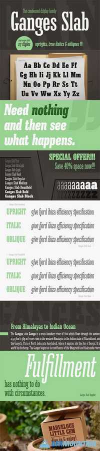
Ganges Slab is a condensed slab serif typeface inspired by Central European advertising typography from late XIX century. It is a perfect match for Ganges Sans. The font has condensed proportions and original letter shapes. Ganges is designed mainly for editorial design, especially for display use, as well as short paragraphs of text. Its narrow proportion makes it very practical to use for posters and magazine covers. Characteristic letter forms fit great for branding, logo and packaging design. It is also a very interesting choice for websites and e-book headlines.Ganges Slab family consist of 27 fonts - 9 weight, 9 italics and 9 obliques. It supports extended set of latin languages, as well as broad number of OpenType features, such as case sensitive forms, standard and dicretionary ligatures, stylistic alternates, contextual alternates, lining, oldstyle and tabular figures, slashed zero, fractions, superscript and subscript, ordinals, currencies and symbols.
Read more