Boita Font Family

Boita Font Family

Boita Font Family
5 TTF
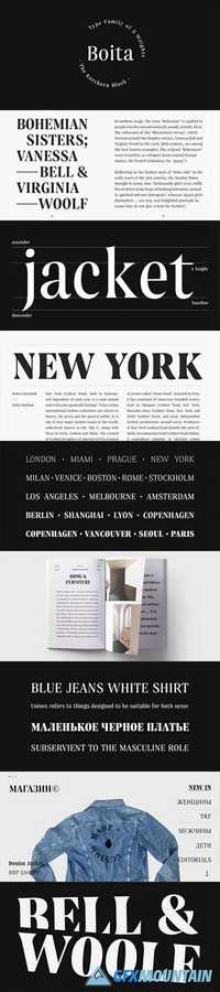
Boita is an elegant display serif type family. Designed for high impact, it features generous x-height, high contrast, confident curves and sharp serifs. Its condensed proportions allow for a great impact even in limited spacial situations. Boita forms “smooth as velvet” texture on the page, whilst remaining distinctly confident. It supports both Latin and Cyrillic scripts.
Read more

Bourton Font Family

Bourton Font Family

Bourton Font Family
34 TTF
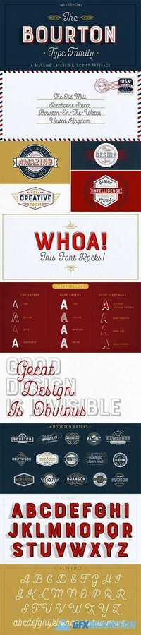
Bourton is a new typeface by Kimmy Design. It’s the sans-serif cousin to Burford. In addition to a new look, it boasts more layering options, stylistic alternatives, graphic extras and even comes with it’s own script font!To top it off, we are providing you with a set of over 30 free bonus logo templates. These mock-ups utilize some of Bourton’s extras and contain live text. Simply change the placeholder text with your own and ‘BAM!’ you now have a sweet logo. Hopefully these provide some inspiration of how you can use the graphic extras, layering options and script font together to make something awesome. To receive this, please reach out to Kimmy Design with your purchase receipt.
Read more

Flabbergast Font Family

Flabbergast Font Family

Flabbergast Font Family
2 TTF
Flabbergast is a modern Didone for headlines with wide language support. After creating all of the design for my card game Assumptions using Didot, I felt inspired to create an even higher contrast font, with more personality, for print and screens. I set out only to make one weight (regular) but fell in love with even heavier verticals and added a bold weight.
Read more

Clareza Font Family

Clareza Font Family

Clareza Font Family
2 OTF
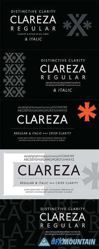
Clareza means “Clarity” in Portuguese. That was exactly the goal in creating this font. We managed to create a font that is crisp and extremely legible at all sizes but then comes to life in an interesting and unusual way when used as a display font. The glyph traps are at the heart of Clareza’s unusual style: they were carefully designed to become a great feature at display sizes, adding an interesting personality without dominating. Clareza is a solid Geometric workhorse ideal for clear, legible, applications including branding, advertising and signage. If you are looking for a font that is crisp with a little more personality, Clareza will absolutely fit the bill!
Read more

Bergen Sans Font Family

Bergen Sans Font Family

Bergen Sans Font Family
6 OTF
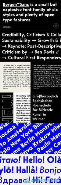
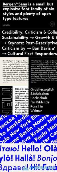
Bergen Sans is a contemporary sans serif font family of 6 fonts. Carrying clean and stylized Scandinavian geometry, partnered with explosive post Bauhaus type aesthetics, Bergen Sans is perfect companion in any designer’s ‘survival’ kit. While being a small font family it has unlimited capabilities and plenty of Open Type features for highly professional use. Bergen Sans also includes Extended Latin, Cyrillic (including Bulgarian alternates) and Greek language support.
Read more

Chronic Font Family

Chronic Font Family

Chronic Font Family
7 TTF
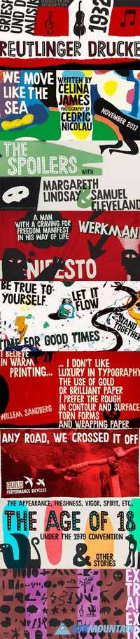
Chronically strong, yet pacific. Chronically bold, yet friendly.
This font was at first inspired by a HAP Grieshaber work and soon incorporated elements from pieces by Willem Sandberg, two astonishing artists who lived through two world wars. They had to struggle for freedom and consistently manifested, with words, works and actions, their absolute love of liberty. Both were chronically free. As this font intends to be.
Read more

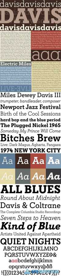
Davis Font Family

Davis Font  Family

Davis Font Family
8 TTF
Over the past couple of decades, the many applications that joined print as media requiring design solutions have combined to necessitate a visual evolution that favours controlled optical geometry and careful counter-space consideration over ornamental features traditionally associated with print design. This is now true in corporate, advertising and interface design, and is even spilling over into editorial layouts. Such focus on clarity and precision in modern design environments have brought to light the many issues that riddle classic print faces, and increased the call for new solutions. The reinvigorated type design market responded to the demand, sometimes with original takes that build on the classics, and sometimes with merely subtle differences from the old aesthetics.
Read more

Cerulea Font Family

Cerulea Font Family

Cerulea Font Family
14 TTF
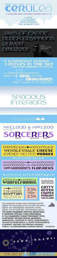
Cerulea is a unicase from the world of the sky. Drawing inspirations from Art Nouveau, Classical Roman, and Uncial styles, Cerulea’s wide, spacious bowls, sharp points, and subtle wandering curves evoke airiness, flight, and fantasy. Seven weights, and true italics for each, range from zephyrous to thunderous. Vary the mood every time you choose between the serious capital form of a letter, the more fanciful lowercase form, or another variant in the stylistic sets. The more than 800 glyphs cover pan-European Latin, Greek, Cyrillic, fractions, circled numbers, planet and zodiac symbols, card suits, chess pieces, ornaments, and more.
Read more

Davis Sans Font Family

Davis Sans Font Family

Davis Sans Font Family
8 TTF
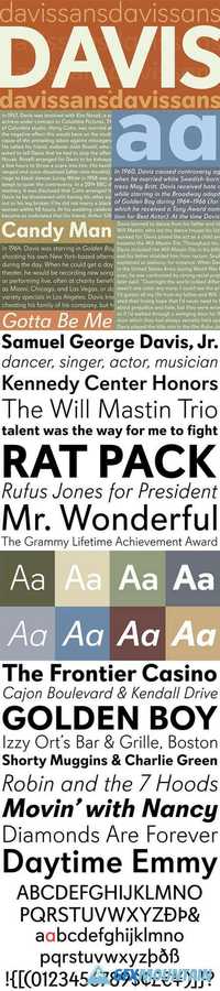
Over the past couple of decades, the many applications that joined print as media requiring design solutions have combined to necessitate a visual evolution that favours controlled optical geometry and careful counter-space consideration over ornamental features traditionally associated with print design. This is now true in corporate, advertising and interface design, and is even spilling over into editorial layouts. Such focus on clarity and precision in modern design environments have brought to light the many issues that riddle classic print faces, and increased the call for new solutions. The reinvigorated type design market responded to the demand, sometimes with original takes that build on the classics, and sometimes with merely subtle differences from the old aesthetics.
Read more

Bergen Sans Font Family

Bergen Sans Font Family

Bergen Sans Font Family
6 OTF
Bergen Sans is a contemporary sans serif font family of 6 fonts. Carrying clean and stylized Scandinavian geometry, partnered with explosive post Bauhaus type aesthetics, Bergen Sans is perfect companion in any designer’s ‘survival’ kit. While being a small font family it has unlimited capabilities and plenty of Open Type features for highly professional use. Bergen Sans also includes Extended Latin, Cyrillic (including Bulgarian alternates) and Greek language support.
Read more

Hogar Slab Font Family

Hogar Slab Font Family

Hogar Slab Font Family
16 TTF
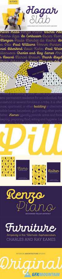
Hogar Slab, based on the Hogar typeface, is the result of combining a script and a slab serif into a single type system.
The system has a monolinear style composed of a slab serif and a script slab serif version that share similar proportions, weight interpolations and details. Hogar Slab is basically a slab serif with script gestures and a script with slab serif shapes.
In order to make the system more complete, I included an italic version, which represents a transition between both main styles. Additionally, I developed a set of patterns including some furniture designs by well-known architects.
Read more

Bely Font Family

Bely Font Family

Bely Font Family
5 OTF
Bely is the first design by French newcomer Roxane Gataud. Too many typefaces are either governed by fear and never accomplish what they could, or are unrestrained which results in their frenetic dangling like a leaf caught in a spider’s web. Bely’s strength is that it has both restraint and freedom throughout the text weights and into the unique display weight. There is no fear in this type family, but only great respect for both the tradition of reading and the opportunity to make an impression. Bely is a high-class throwback containing four text weights which were built upon classical proportions to capitalise on reading familiarity. Bely Text features balanced capitals and a play between large, triangular serifs at the top and thick, bracketed, rectangular serifs at the bottom. The family is capped by a radical, expressive French-style display weight which pushes the rules of the text weights to their logical extreme. Bely Display, truly daring with its monstrous and angled contrast, exploits the features which make an impression at larger sizes. In the end, Bely Display is adventurous when used in packaging, identities, and headlines with attitude, while Bely Text’s calm baseline and piercing ascenders give paragraphs texture and familiarity. Bely covers the Latin A Extended glyph set and brings its sense of confidence to your projects with its two text weights, matching italics, and unique display style. Bely’s satisfying OpenType features allow for the implementation of typographic niceties such as small caps, both tabular and proportional lining and oldstyle figures, ligatures, alternate characters, case-sensitive variants, and fractions. The complete Bely family, along with our entire catalogue, has been optimised for today’s varied screen uses.
Read more

Winnie the Hoop Font Family

Winnie the Hoop Font Family

Winnie the Hoop Font Family
3 OTF
Winnie the Hoop is a bold, friendly and round display family inspired by a certain well known teddy bear. The family consists of three styles; Roman, Italic and Script, which are designed to be combined together. You can use any of the three styles as your main style and use the others to create multilayered typography that all share the same aesthetic. The typeface is well suited for branding and packaging design, advertisements, posters and even editorial design as a headline style. The Script is packed with ligatures and has Swash alternates that make it easy to customise your design. All styles include two sets of numerals.
Read more

Les Paul • Font Family

 Les Paul • Font Family

Les Paul • Font Family
8 OTF
LES PAUL - Layered Font Family with Retro Extras! Inspired by post cards and advertising from 50's and early 60's Les Paul will be cool item in your collection. "Les Paul" has a 7 styles and you can combine them to get really great view of your project. Use Lined Style for shadow or use it as front side - it will be good. Choose inline style - four different way. And add a outline as a decor of your type graphic.
Also, you can find type graphics as Extras style. Add this cool retro look pic to awesome result! Looking good in Book Titles, Posters, Mugs, T-Shirts, Greeting Cards etc.
Read more

Clone Font Family

Clone Font Family

Clone Font Family
16 TTF
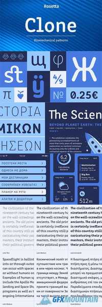
Clone is a type family by Lasko Dzurovski from Macedonia. The lovechild of cyber-culture and genetic font modification takes inspiration from coding, technology and architecture. A quasi-monospaced typeface that gives a nod to the quirkiness of engineered fonts without sacrificing a natural reading experience. Biomechanical future meets CAD blueprints. The first generation of Clone has rounded forms, the next one is already in the making.
Read more

Doblo Font Family

Doblo Font Family

Doblo Font Family
10 TTF
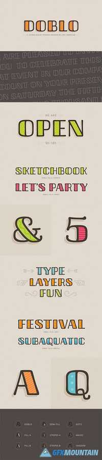
Doblo is a colorful and slightly retro layered type family designed by Joel Carrouche. Consisting of one master character, 8 different layers and a collection of extra ornaments, this fancy family allows several creative combinations and produces unique results. The fonts are delivered in OpenType format and include diacritics for most western & central European languages.
Read more

Quintus Font Family

Quintus Font Family

Quintus Font Family
2 TTF
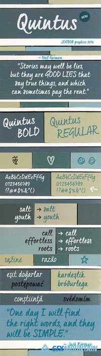
This font is an adaptation of the typeface I designed for TJX Europe, which was used in their branding campaigns for the TK MAXX stores all over Europe. Most characters were given a major facelift and also a few extra ligatures were added in the process.
Quintus comes with a regular and a bold version so it offers more variety in use. It also works well in all caps.
Read more

Between Font Family

Between Font Family

Between Font Family
48 OTF
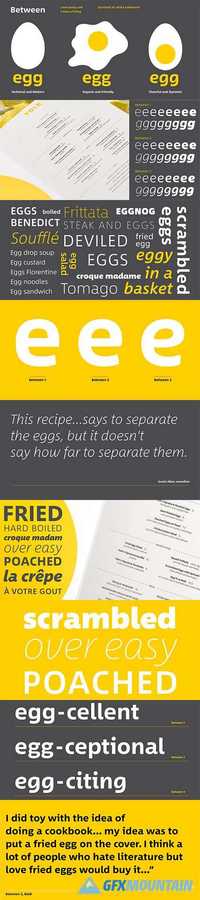
There are three states to Akira Kobayashi’s Between™ typeface and, while different from each other, they all offer a human-centered design to ensure that copy set in them is affable and approachable. An added benefit is the ability to transition “between” the designs, choosing different styles – or even individual characters – to create hierarchy, contrast or emphasis. Kobayashi designed the Between typeface in response to the current use of rounded and humanist sans serif designs, over the cool grotesques of the 20th century. Between 1, melds industrial and humanistic sans serif design ethics. Between 2 is based on the idea of sans serif version of Kobayashi’s Cosmiqua® typeface. It strikes a balance between being crisp and legible, and organic and friendly. Between 3 is a freestyle sans with an uplifting sprightly mien. Between has 48 styles and each has eight weights of roman – each with an italic counterpart. The family also benefits from a large set of alternative glyphs and many OpenType® features.
Read more