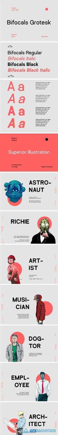
Uncial Antiqua Pro Font Family
Uncial Antiqua Pro Font Family
OTF TTF
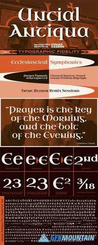
Our Uncial Antiqua Pro is a hybrid typeface which combines the speedier penned styles of Uncial and Half Uncial letterforms together in a formal text representation. Signature letterforms to the Uncial & Half Uncial styles are not sacrificed in this compilation, yet readability is surprisingly maintained when read in context. The SmallCaps and extensive figure sets only further expand the range of usability and appeal.
OTF TTF
Our Uncial Antiqua Pro is a hybrid typeface which combines the speedier penned styles of Uncial and Half Uncial letterforms together in a formal text representation. Signature letterforms to the Uncial & Half Uncial styles are not sacrificed in this compilation, yet readability is surprisingly maintained when read in context. The SmallCaps and extensive figure sets only further expand the range of usability and appeal.