Virtuous Slab Font Family
Virtuous Slab Font Family
5 OTF
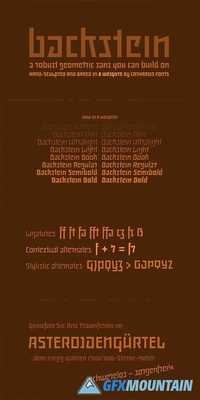
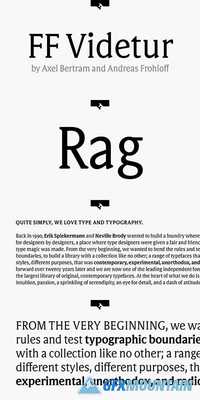
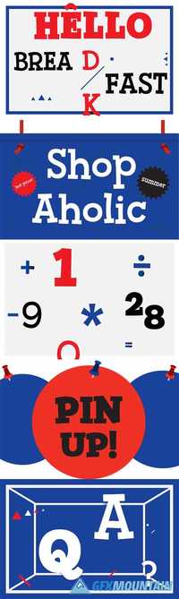
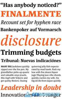
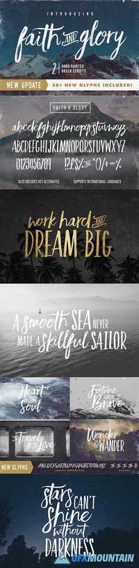
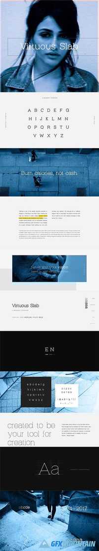
Here comes Virtuous Slab Serif Font from Graphic Pear! Slab fonts are a type of serif fonts characterized by thick or block-like serifs. They are well known for its legibility. Additionally, Slab fonts have been in use for a really long time; about 200 years ago. During that time, different styles and groups have been in use. Virtuous Slab is a slab serif font useful particularly in creating amazing designs. Fonts are like treasure to designers who always struggle to find good fonts, and this font is an example of that.
5 OTF
Here comes Virtuous Slab Serif Font from Graphic Pear! Slab fonts are a type of serif fonts characterized by thick or block-like serifs. They are well known for its legibility. Additionally, Slab fonts have been in use for a really long time; about 200 years ago. During that time, different styles and groups have been in use. Virtuous Slab is a slab serif font useful particularly in creating amazing designs. Fonts are like treasure to designers who always struggle to find good fonts, and this font is an example of that.