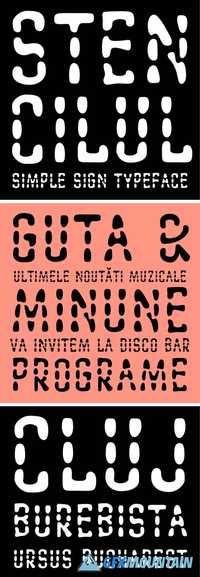
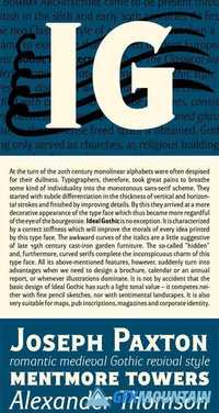
Mediaeval Font Family
Mediaeval Font Family
8 OTF
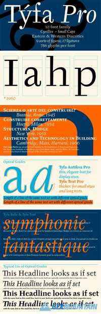
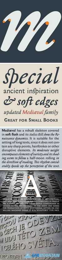
Medi?val has a robust skeleton covered in soft flesh and its italics still show the Renaissance dynamics. It is suitable for the setting of long texts, since it does not contain any sharp points, hairstrokes or other disruptive elements. Its moderate weight encompasses elements of variety and its shading seems to follow a half-moon rolling in the direction of reading. This rhythm considerably speeds up the perception of the text.
8 OTF
Medi?val has a robust skeleton covered in soft flesh and its italics still show the Renaissance dynamics. It is suitable for the setting of long texts, since it does not contain any sharp points, hairstrokes or other disruptive elements. Its moderate weight encompasses elements of variety and its shading seems to follow a half-moon rolling in the direction of reading. This rhythm considerably speeds up the perception of the text.