PF Das Grotesk Pro Font Family

PF Das Grotesk Pro Font Family

PF Das Grotesk Pro Font Family
14 OTF
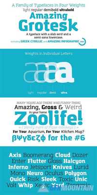
Das Grotesk was inspired by earlier nineteenth-century grotesques, but it is much more related to American gothic designs such as those by M.F. Benton. Due to their pure geometric structure, most grotesque typefaces tend to have a rather monotonous and lifeless appearance, thus failing to express the ideals of the modern creed.
Read more

Monrad Bundle Offer - Sans + Grotesk

Monrad Bundle Offer - Sans + Grotesk

Monrad Bundle Offer - Sans + Grotesk
48 OTF 48 TTF 24 WOFF 24 EOT 24 SVG
Now you have a change to get a package of Monrad Font Family. This bundle of fonts contains all the Monrad font family - Sans and Grotesk version. consist 24 weights - Black, Bold, Semibold, Regular, Light, EkstraLight + Italic.
Read more

Monrad Grotesk Family

Monrad Grotesk Family

Monrad Grotesk Family
OTF, TTF, WEBFONT
Monrad Grotesk is a modern font characterized as a sans serif. It a another version from Monrad Sans. The font consists 6 styles including italic version, manually edited kerning. The idea of the font is to create a blend of dynamics and organic balance in the letters.
Read more

Breul Grotesk Font Family

Breul Grotesk Font Family

Breul Grotesk Font Family
32 TTF
Taking inspiration from an attempt to marry art with industry of Bauhaus (1919), Brueul Grotesk is classic and straightforward, cutting back superfluous elements. A Sans Serif type, it’s like a design from the Machine Age. It comes in A and B sets to offer end variations—choose the bulbous terminals set if you need a less stern impression. It then is suitable for diverse demands.Brueul Grotesk has A and B sets with 16 letters each, giving you an all-purpose usage.
Read more

Campaign Grotesk Font Family

Campaign Grotesk Font Family

Campaign Grotesk Font Family
12 OTF
This handsome new typeface incorporates exuberant curves, subtly curled terminals, and rare forms such as its upright looped lowercase k. The comfortably wide-set family covers six weights, each complete with an optically corrected companion oblique. Available in 6 weights ranging from Thin to Black.
Read more

Reforma Grotesk Font Family

Reforma Grotesk Font Family

Reforma Grotesk Font Family
4 OTF
PT Reforma Grotesk was designed for ParaType in 1999 by Albert Kapitonov based on the letterforms of Russian pre-revolutionary hand composition typefaces: Uzky Tonky Grotesk («Condensed Thin Sans»), Poluzhirny Knizhny Grotesk («Semibold Book Sans») and Reforma, of H. Berthold and O. Lehmann foundries (St.- Petersburg). This extra compressed sans serif with distinctive letter shapes is typical for display fonts of the late 19th and early 20th centuries. For use in advertising and display typography. The face got ‘Galina’ prize at Kirillitsa'99 International Type Design Competition in Moscow.
Read more

Astrid Grotesk Font Family

Astrid Grotesk Font Family

Astrid Grotesk Font Family
8 OTF
Astrid Grotesk is a normalized version of Schizotype Grotesk. Normalized; not neutralized. Where many neo-grotesks appear cold with their harsh neutrality, Astrid has a warmth, eminating from its (for want of a better word) clunkiness. These upright styles represent the first part of what will be a large suite of fonts. They will be followed by italics, condensed styles, and possibly a slab-serif counterpart. Early adopters will be looked after though. If you purchase the upright family now, the italics and condensed fonts will be yours for free when they are released.This typeface will be useful for corporate identities and branding work. It’s spaced more for text settings, but will work well for display, especially with some negative tracking. Bored of those other Swiss style typefaces? Astrid Grotesk could be the face you need to breathe new life into your designs. Coupled with Schizotype Grotesk, its more eccentric cousin, you've got an unorthodox branding system ready to use straight out of the box.
Read more

Schizotype Grotesk Font Family

Schizotype Grotesk Font Family

Schizotype Grotesk Font Family
9 TTF
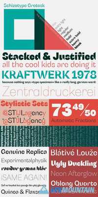
A neo-grotesk with a bit more bite, this is Schizotype Grotesk. It’s not your usual grot; this is purely display typography. Notches cut deep into the letterforms and the thick/thin contrast isn't always where you might expect. It’s intended to be a challenging typeface - not beautiful or particularly ‘useful’ in any conventional sense, but it is at the very least interesting. In a world where everyone and their dog has their own grotesk offering, perhaps being interesting and that little bit different is in itself enough to give the face its utility.
Read more

Bright Grotesk Font Family

Bright Grotesk Font Family

Bright Grotesk Font Family
16 TTF 16 OTF
Bright Grotesk is inspired by grotesque & humanist typefaces suggesting a serious yet friendly personality. It is designed to be legible in small sizes yet charmingly attractive in large settings.
Bright Grotesk is a neutral design with a subtle touch of flair. It feels old but looks new, warm yet active, symmetrical yet organic, classic yet modern. Bright Grotesk has great details that reveals in display sizes and can be felt in small sizes as well.
Read more