Chiswick Headline Font Family

Chiswick Headline Font Family
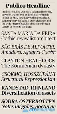
Chiswick follows the path taken by John Baskerville (1706–1775) in taking the handmade letter and fixing it in type. The single surviving example of Baskerville’s lettering, cut in the 1730s, shows the vernacular letter that would be the model for his later adventure in printing. As a modern serif design, Chiswick has high contrast between thick and thin, yet its freewheeling shapes make it quite distinct from other members of the genre, such as Didot, Bodoni or a Scotch Roman. At the same time, its crisp contrast makes it different from a transitional design such as Baskerville or the types cut by Richard Austin for John Bell, which are more formal in style. Chiswick Headline is designed for situations where Chiswick Poster is too delicate and Chiswick Deck too heavy in its thins and serifs; perfect for sizes from 30 point to 60 point.


