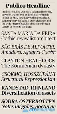
Publico Headline

12 TTF
Structurally, Publico takes many cues from contemporary type design, with its narrow proportion, consistent character widths, square, sturdy skeleton, and a pleasant openness. The balanced interplay between sharp serifs and soft ball terminals and lack of fussy details gives the face a clean, contemporary look and a quiet elegance, and the wide range of weights makes Publico Headline well-suited to any kind of publication design.
nitroflare.com: Download
