Lexia Mono Font Family

Lexia Mono Font Family

Lexia Mono Font Family
6 TTF
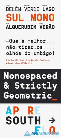
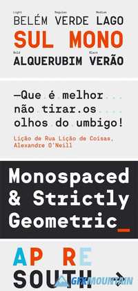
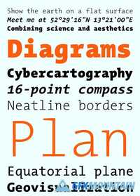
Lexia Mono was drawn specifically with programmers and designers who work with tough compositional issues in mind. Its clean, uninterrupted rhythm and even colour make it remarkably easy to read, while its characters, redesigned to make full use of the bounding box, flow just like on a typewriter. Unlike many monospace font families which consist of only Regular and Bold weights, Lexia Mono also features a Light, stylish true italics, and box-drawing characters for terminal use
Read more

MONO PRO VOL. 1 - VOLUMETRIC 2202909

MONO PRO VOL. 1 - VOLUMETRIC 2202909

MONO PRO VOL. 1 - VOLUMETRIC 2202909
Based on the principles of the Color Theory and taking into account the colors of the female skin, the actions give the images a classic Hollywood look, with a range of shades from silverish to porcelain, depending on the conditions of the shooting. It is desirable to prepare the image in advance (the Skin Retouch, the proper Exposure, etc.).
Read more

Sul Mono Font Family

Sul Mono Font Family

Sul Mono Font Family
5 TTF
Sul Mono is a geometrically constructed monospaced family of five fonts. It is the fixed width version of Sul Sans, a typeface with features observed in capital letters on signs and buildings in Portugal.
Sul Mono’s glyphs width is the standard, so it takes the exact same horizontal space as popular monospace fonts, like Courier or Andale Mono.
The name Sul (South), hints to a southern european flavour on a typically northern style of typeface.
Read more

Sul Mono Font Family

Sul Mono Font Family

Sul Mono Font Family

Sul Mono is a geometrically constructed monospaced family of five fonts. It is the fixed width version of Sul Sans, a typeface with features observed in capital letters on signs and buildings in Portugal. Sul Mono’s glyphs width is the standard, so it takes the exact same horizontal space as popular monospace fonts, like Courier or Andale Mono. The name Sul (South), hints to a southern european flavour on a typically northern style of typeface.
Read more

Knif Mono Font

Knif Mono Font

Knif Mono Font

Knif (pronounce [Ka-neef]) is an acute and sharp-as-a-knife monospaced typeface. Its starkness results from a very short and intense design process. Knif is the product of a team of 4 french people: It has been designed by Axel Pelletanche-Thevenart under the artistic direction of Guillaume Grall and Benoit Santiard, then Emilie Rigaud, head of “A is for… type foundry”, took care of the production of the final typeface.
Read more