Publico Text Mono Font Family
Publico Text Mono Font Family
8 OTF
8 OTF
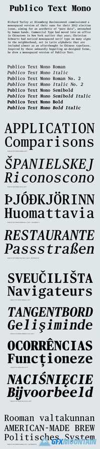
When Bloomberg Businessweek was starting work on their election issue in 2012, Richard Turley commissioned a monospaced version of their sans, with the aim of using it to make data look purely like data, untouched by human hands. Commercial Type had moved into an office in Chinatown in New York earlier that year; Christian Schwartz had noticed monospaced serif type on many signs in the neighborhood. Inspired by these awkwardly beguiling un-designed forms, he offered to draw a monospaced version of Publico Text as well, enabling data to look like data in Businessweek's serif face as well. Though it was not space-efficient enough for this special issue, it appeared in info graphics and in feature headlines in many subsequent issues. Greg Gadzowicz added the italics, which are optically corrected obliques, in keeping with the un-designed aesthetic, in 2014.
