FB Kobenhavn Font Family

FB Kobenhavn Font Family

FB Kobenhavn Font Family

Copenhagen has been in need of a typeface that unites the city’s many visual expressions. The three designers Morten Rostgaard Olsen, Henrik Birkvig and Ole Sondergaard have designed and developed the typeface FP Kobenhavn. Now available from MyFonts in 16 styles: Italics, Stencils & Symbols. The shapes of the letters are inspired by the city’s culture and the visual environment and design in Denmark in the 20th century. It is relatively low and wide as the city itself and with rounded corners that give it a warm visual mood. “You can find examples of the use of a typeface with the same purpose in other parts of the world, for example, to identify local areas or urban tourism materials. FP Kobenhavn is our take on that kind of typeface” the designers add.
Read more

Futura PT Font Family

Futura PT Font Family

Futura PT Font Family
22 OTF
Futura was designed for Bauer company in 1927 by Paul Renner. This is a sans serif face based on geometrical shapes, representative of the aesthetics of the Bauhaus school of the 1920s-30s. Issued by the Bauer Foundry in a wide range of weights and widths, Futura became a very popular choice for text and display setting. Originally Cyrillic version of eight styles was developed at ParaType (ParaGraph) in 1995 by Vladimir Yefimov. Additional Cyrillic styles were developed in 2007 by Isabella Chaeva. Simultaneously, the old eight styles were partly revised to match the whole family. Now the new Futura is an uniform type system, consisting of seven weights with corresponding obliques plus eight condensed styles. All these fonts are coordinated in letterforms, metrics, and weights to work better together.
Read more

FF Dora Font Family

FF Dora Font Family

FF Dora Font Family
4 OTF
The family has 5 weights, including a Display style, and is ideally suited for book and magazine design as well as small text. FF Dora provides advanced typographical support with features such as ligatures, small capitals, alternate characters, case-sensitive forms, fractions, and super- and subscript characters. It comes with a complete range of figure set options – oldstyle and lining figures, each in tabular and proportional widths.
Read more

Akhand Bengali Font Family

Akhand Bengali Font Family

Akhand Bengali Font Family
8 OTF
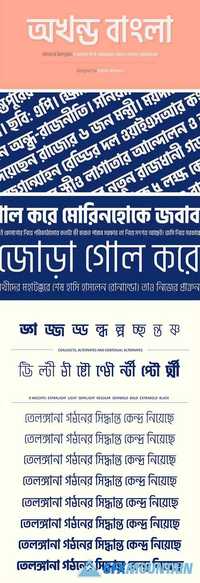
Akhand Bengali is a family of 8 compact mono-linear typefaces and part of the super family Akhand Multiscript. The letterforms are dynamic; typically round shapes appear more compact, as their verticals have been flattened. This ‘straightening out’ gives text set in the typefaces a streamlined look. Akhand Bengali is designed according to a modular system. All shapes bear a strong commonality to each other, without becoming repetitive. However, the curves in the modules have all been optically corrected, removing the mechanical nature that would otherwise become too dominant. The Akhand Bengali family includes eight font styles. This broad range of weights makes combinations with a strong degree of contrast possible; the lightest and the heaviest styles may be mixed to create a powerful effect in your design. Each font style contains 663 glyphs, offering full support for conjuncts and ligatures.
Read more

Blunt Font Family

Blunt Font Family

Blunt Font Family
8 OTF
Blunt is a refreshing new bold headline typeface, designed to be an alternative to overused headline typefaces such as Impact. Blunt is more than just a one-trick-pony though, but includes 4 weights (Condensed - Wide) each with matching italics. This gives Blunt a lot more versatility when it comes to headline use. Try Blunt today and shout your most important messages with boldness!
Read more

FF Mark Pro Font Family

FF Mark Pro Font Family

FF Mark Pro Font Family
20 OTF
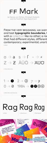
Ze new Germanetric sans by Hannes von Dohren, Christoph Koeberlin and the FontFont Type Department. Strong, simple, bold and created with utmost consideration and precision. True to geometric tradition, contemporary for today’s needs.
Read more

Triplex Font Family

Triplex Font Family

Triplex Font Family

Although initially designed as a rational/geometric font, Triplex developed into one of Zuzana Licko’s most intuitive typeface designs at the time. Its first extensive use was in Emigre magazine #14, a special issue devoted to Swiss designers published in 1990. Triplex was intended as a friendly substitute for Helvetica. The name Triplex refers to the three versions that make up the entire family; Triplex, Triplex Serif and Triplex Italic. Each version of the typeface comes in light, bold and extra bold. The italic was designed and drawn by type designer and sign painter John Downer, and was designed to work with both the serif and sans serif versions.
Read more

Florentia Font Family

Florentia Font Family

Florentia Font Family
18 OTF
Florentia is a humanist sans-serif typeface designed by Francesco Canovaro developing his Beatrix Family design. Florentia takes its inspiration from the classic Roman monumental capital model of Beatrix but develops the influences derived from the stone carvings in Florence Santa Croce Cathedral into a more contemporary overall design, featuring lower X-height and an extended character set that covers over forty languages using the latin alphabet, as well as Greek and Russian Cyrillic.
Read more

Kitami Font Family

Kitami Font Family

Kitami Font Family
6 OTF
Talbot Type Kitami is a minimal, geometric, stencil display font, inspired by Herbert Bayer’s Universal Typeface, created at the Bauhaus in the 1920s. Each character is created from a single continuous stroke, or combination of strokes.
Read more

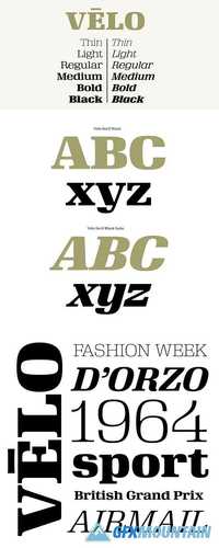
Velo Serif Font Family

Velo Serif Font Family

Velo Serif Font Family
16 OTF
Velo leads layouts with a grand tour champion’s panache but is also a hard-working design domestique for text-heavy applications. Superelliptical shapes and sturdy serifs will keep pace with contemporary culture with an aesthetic agility that will never go out of style.
Velo Serif includes sixteen fonts: Twelve display styles ranging from thin to black with complementary italics and four text styles designed for longer settings. Velo Serif Display features an increased x-height for more illustrative headlines while Velo Serif Text maintains a readable cadence in high word count environments.
Designed by House Industries, Christian Schwartz, Mitja Miklavcic and Ben Kiel.
Read more

FS Joey Font Family

FS Joey Font Family

FS Joey Font Family
20 OTF
FS Joey was the offspring of a project with Rudd Studio to develop a logotype for an online streaming TV service, in 2008. While under wraps, the secret project was code-named Kangaroo. The logotype led to a second project, to design a corporate typeface for the service. It was the first big project Fernando Mello had worked on with Jason Smith. “Like any designer who just joined a team, I was very excited about it, drawing and sketching lots of ideas. I remember Jason and I experimenting with lots of possibilities, for both the logo and the typeface.”
Read more