Bw Gradual Font Family
Bw Gradual Font Family

Bw Gradual Font Family
14 OTF
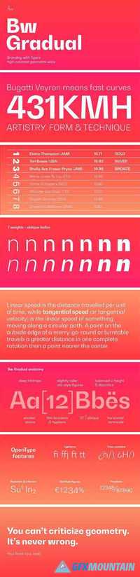
Bw Gradual brings together the pragmatic feel of the geometric grotesque genre with the visual appeal of its very deep joins. Pure shapes and fast curves coexist on this versatile font family that claims for attention when used large, but also delivers a very confortable reading experience when used as body copy, thanks to the deep joins acting as ink traps. Designed by Alberto Romanos, Bw Gradual is available in 7 weights from the delicate Thin to the robust Black with accompanying oblique italics. It supports all European Latin languages and it includes OpenType features like ligatures, old style figures or case sensitive forms among others.
Read more

Lido STF Font Family

Lido STF Font Family

Lido STF Font Family
6 OTF
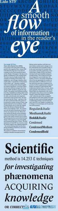
Lido is suitable for all periodicals wishing to abandon inconspicuously the hideous system typefaces with their even more hideous accents and to change over to the contemporary level of graphic design. It is also most convenient for everyday work in text editors and office applications. It has a fairly large x-height of lower case letters, shortened serifs and simplified endings of rounded strokes. This is typical of the typefaces designed for use in small sizes. Our typeface, however, can sustain enlargement even to the size appropriate for a poster, an information table or a billboard, as it is not trite and at the same time is moderate in expression.
Read more

Pentagraf Font Family

Pentagraf Font Family

Pentagraf Font Family
12 OTF
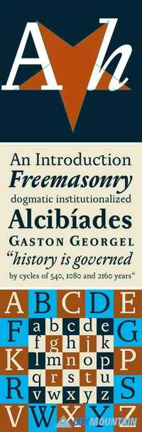
The five-pointed star gave vertical proportions to this typeface. The cap-height, x-height, ascenders and angles of all important diagonals have been taken from the pentagram. Other elements and details are geometrically constructed, too. This typeface is especially suited for any kind of hermetic and occult literature and poetry, where symbols play an important role. Its appearance is surprisingly clean and neutral enough to be comfortable for long reading, naturally of any kind of text. Pentagraf is already proven as a workhorse in art catalogues, where its humble letterforms don't disturb art reproductions.
Read more

Mediaeval Font Family

Mediaeval Font Family

Mediaeval Font Family
8 OTF
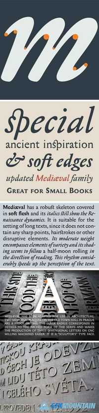
Medi?val has a robust skeleton covered in soft flesh and its italics still show the Renaissance dynamics. It is suitable for the setting of long texts, since it does not contain any sharp points, hairstrokes or other disruptive elements. Its moderate weight encompasses elements of variety and its shading seems to follow a half-moon rolling in the direction of reading. This rhythm considerably speeds up the perception of the text.
Read more

Stanley Font Family

Stanley Font Family

Stanley Font Family
5 OTF
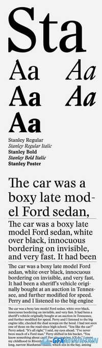
‘Stanley’ is a new typeface from Ludovic Balland, inspired by ‘Times New Roman’, one of the most classic typefaces of the 20th century. Stanley Morison, after criticizing the British newspaper ‘The Times’ of being typographically outdated was then commissioned to create a new font.
Read more

Tenebra Font Family

Tenebra Font Family

Tenebra Font Family

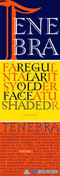
Tenebra is an example of a combination of the Baroque inscriptional majuscule with decorative calligraphic elements and alchemistic symbols. The widespread forms of the letters allows for the use of the old German manner of writing of the „umlaut“ when, in place of two dots above the letter, there is a reduced E. In our case it is inserted in the open letters. This concerns only the decorative upper-case letters in the position of the lower case. The upper-case letters of the basic design are a monumental alphabet without any embellishments, having a classic, two-dotted „Umlaut“. Tenebra Shaded and Old Face decorate, but do not refine.
Read more

Antipasto Pro Font Family + Icons Pack

Antipasto Pro Font Family + Icons Pack

Antipasto Pro Font Family + Icons Pack

Antipasto is a geometric sans serif font designed by Cosimo Lorenzo Pancini. The original family of three weights has been revised and expanded in 2017 with Antipasto Pro that now includes Cyrillic and greek characters, open type features (small caps and old style numerals) and six new weights from the hairline to the extrabold.
Read more

Apax Font Family

Apax Font Family

Apax Font Family

This new typeface by Francois Rappo explores the visual grammar of constructivism through a modernist lense. Thanks to a rigorous and systematic design, Apax reveals a strong constructivist identity. Its geometric architecture develops radical shapes through many distinctive letters. Still, this uncompromising approach is combined with the tradition of modern grotesques based on functionalism. Therefore Apax is drawn with the unique optical balance that characterizes Francois Rappo’s typefaces. The fluidity of the typesetting surface allows Apax to be used in a wide range of contexts, from body text to visual identities. Each style proposes alternate glyphs that allow to adapt the typeface to its application context. The family is designed with an optimized contrast gradient available in six styles and their matching italics.
Read more

Styrene Font Family

Styrene Font Family

Styrene Font Family

Styrene, a new sans serif by Berton Hasebe, is his latest exploration of proportion and simplicity in type design. The initial inspiration for the family was a charmingly awkward sans serif called Breede Schreeflooze shown in an early 20th century type specimen published by the Enschede Typefoundry in the Netherlands. However, Styrene has an ahistorical attitude. Its name was inspired by the purposefully synthetic feeling to its curves and geometry. Styrene is characterized by its proportions: typically narrow characters like f j r and t are hyperextended and flattened, adding openness in unexpected places. Styrene’s two widths offer different textures in text: version A is dogmatically geometric, with a stronger overall personality, while version B is narrower for more reasonable copyfit, though not truly condensed.
Read more

Chiswick Headline Font Family

Chiswick Headline Font Family

Chiswick Headline Font Family

Chiswick follows the path taken by John Baskerville (1706–1775) in taking the handmade letter and fixing it in type. The single surviving example of Baskerville’s lettering, cut in the 1730s, shows the vernacular letter that would be the model for his later adventure in printing. As a modern serif design, Chiswick has high contrast between thick and thin, yet its freewheeling shapes make it quite distinct from other members of the genre, such as Didot, Bodoni or a Scotch Roman. At the same time, its crisp contrast makes it different from a transitional design such as Baskerville or the types cut by Richard Austin for John Bell, which are more formal in style. Chiswick Headline is designed for situations where Chiswick Poster is too delicate and Chiswick Deck too heavy in its thins and serifs; perfect for sizes from 30 point to 60 point.
Read more

FS Millbank Font Family

FS Millbank Font Family

FS Millbank Font Family

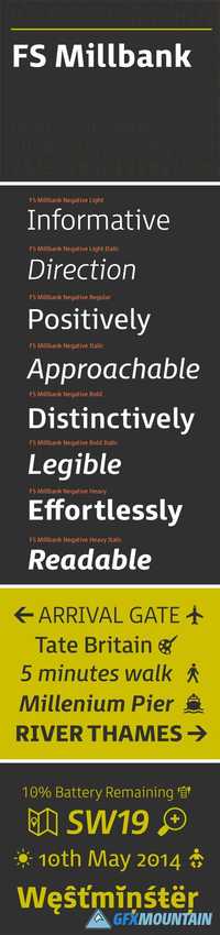
When designer Stuart de Rozario surveyed the fonts used in signage on London’s public transport systems, he reached a dead end. They seemed staid, sterile, lacking in personality, and ill-suited to use by modern brands. He was pointed in another direction entirely. ‘The driving force behind my thoughts was to design something more current and fresh without compromising legibility and clarity. A font with both personality and function, that’s versatile and large and small sizes, and effortless to read, but which also says something new.
Read more