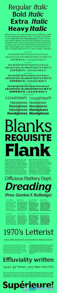
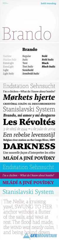
F37 Ginger Font Family

F37 Ginger Font Family

F37 Ginger Font Family
OTF 8 TTF
F37 Ginger started out life as a pure Swiss modernist font, but as time went by, we just couldn't suppress the urge to give it an original and unorthodox geometric twist. We found ourselves repeatedly returning to the work of two legendary typographers throughout F37 Ginger's drawing process, namely Paul Renner and Herb Lubalin. Their early letterforms have been a constant source of inspiration. It was the alternatives in Renner's Futura font and Lubalin's Avant Garde Gothic, in particular, that paved the way for F37 Ginger's signature geometric shapes, and unusual near circular, counters. This makes it an ideal font for logos, headlines and body copy.
Read more

ITC Lubalin Graph Full Family

ITC Lubalin Graph Full Family

ITC Lubalin Graph Full Family
18 OTF 20 TTF
ITC Lubalin Graph® was initially designed by Herb Lubalin and drawn to fit the requirements of typographic reproduction by Tony DiSpigna and Joe Sundwall in 1974. Its underlying forms are those of Lubalin’s previously released ITC Avant Garde Gothic, but its shapes were modified to accommodate large slab serifs. Its condensed weights, which include small caps and oldstyle figures, were later additions by Helga Jorgenson and Sigrid Engelmann in 1992. The family, with its generous x-height and overall tight fit has come to represent the typographic style of American graphic design in the 1970s. The typeface is at home when paired with mid-century modern design and spare sanses or more traditional text faces from the period. ITC Lubalin Graph covers four weights in its condensed width from Book to Bold, and five weights in its normal width.
Read more

BC Reformulate Font Family

BC Reformulate Font Family

BC Reformulate Font Family
8 TTF
There aren’t many fonts on the market which naturally and function­ally combine strict rationality with humanistic calligraphy inspirations. Reformulate proves that even a non-proportional font, created using a very simple principle of shad­owing, need not appear cold, drab and artificial. Jakub Samek dis­plays a good sense of balance between the traditional and the calculated, between banal and thought-out. For him, optical impression and an aspiration for perfect legibility are more important than the perfect consistency of individual characters, taking a free, but educated approach. A geometrical construction, wrapped in an Illustrator brush stroke, was placed onto a cone of uniform width, as dictated by the tools and the grid. In spite of its coarseness in both principles and implementation, Reformulate later found a somewhat surprising application for its use.
Read more

Bianco Serif Font Family

Bianco Serif Font Family

Bianco Serif Font Family
8 TTF
Bianco Serif is the second member of the type family Bianco. The addition of geometric serifs and slanted curves changes the tone and character of text with increased contrast. An excellent companion to Bianco Sans.
Read more

Franchise Full Family

Franchise Full Family

Franchise Full Family
FRANCHISE is a powerful display typeface meant to communicate rapidly and with power without compromising style. Franchise is just as much at home on the front of a donut shoppe as it is on the scoreboard at a football stadium. This was the original description given when the face was released, and it proved quite prophetic as the typeface has been used all over the world in just about every industry. You can get a small taste of its versatility by checking out the face in use. The full version is an extension of the original face, but it is also a re-working of it. Optical adjustments provide for a more legible face, and one that plays nicely in different weights. Rounded corners have given way to decisive edges and deliberate angles. Each weight speaks a distinct language on its own, but mixing the weights provides for an engaging texture and solid balance of legibility and power that works hard for you. And that’s what makes for a great display face, is it not?
Read more

FS Sophie Font Family

FS Sophie Font Family

FS Sophie Font Family
Chic, svelte and slinky, FS Sophie was inspired by and designed in partnership with ATTIK UK. With clean lines, simple, elegant curves and dynamic forms, it brings a feminine sophistication to text and headlines in publishing and advertising.
Read more

Charlie Font Family

Charlie Font Family

Charlie Font Family
Charlie is a slab serif typeface created for use in print and exhibition settings. An affable slab serif, Charlie’s personality is clear and direct, yet warm and polite. Its design is restrained in approach, yet with narrow proportions, high x-height and sharp finishing details it is unique among other slab serifs. Charlie's broad range – from open hairlines to robust black weights – offers a number of options that lend the typeface versatility in use.
Read more

Tomica Font Family

Tomica Font Family

Tomica Font Family
Designed in 2009 for the corporate visual identity of a digital television channel, Tomica was completely redesigned in 2011. Tomica is a sans serif geometric character. Even though it is of original design, Tomica is a descendant of Paul Renner's Futura (1927).
Read more

Lumin Font Family

Lumin Font Family

Lumin Font Family
38 OTF
The Lumin family includes slab-serif, sans serif, condensed and display typefaces, all of which play with the idea of contradiction. The contrast between horizontal and vertical strokes seems to be quite subtle, evoking the slab serifs of the past century. The stroke connections, however, are sharply chiseled, reminiscent of high-contrast modern types, an effect especially pronounced in the heavier weights. The result is hybrid letterforms that look almost like stencil drawings, yet maintain high legibility at the smallest sizes.
Read more

Valter Font Family

Valter Font Family

Valter Font Family
14 OTF
Valter is a graceful and slightly cheeky collection of sans-serif display fonts inspired by pointed-pen writing. Constructed on a monolinear skeleton, it offers seven weights that incrementally increase the contrast between the horizontal and vertical strokes. The thin styles appear wider, while the heavier weights feel normally proportioned, as only the interiors of the letters gain weight. Valter also includes narrower, cursive italics, as well as small caps and advanced OpenType layout features, creating a refined type family of 16 styles.
Read more

Compacta Font Family

Compacta Font Family

Compacta Font Family
36 OTF
Compacta is the work of Fred Lambert and is reminiscent of the extremely narrow, sans serif stencilled fonts of the 1920s, then intended as titles or headlines for magazines and posters. The characters of all cuts are narrow and the space between letters is very small. The white spaces between strokes are perceived almost as only small white stripes and dots which stand out from the black bands of the lines of text. Compacta is not meant for longer texts but is impressive in titles and headlines.
Read more