Valter Font Family
Valter Font Family
14 OTF
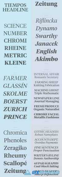
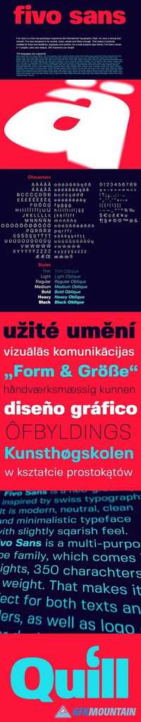
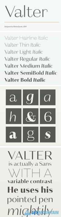
Valter is a graceful and slightly cheeky collection of sans-serif display fonts inspired by pointed-pen writing. Constructed on a monolinear skeleton, it offers seven weights that incrementally increase the contrast between the horizontal and vertical strokes. The thin styles appear wider, while the heavier weights feel normally proportioned, as only the interiors of the letters gain weight. Valter also includes narrower, cursive italics, as well as small caps and advanced OpenType layout features, creating a refined type family of 16 styles.
14 OTF
Valter is a graceful and slightly cheeky collection of sans-serif display fonts inspired by pointed-pen writing. Constructed on a monolinear skeleton, it offers seven weights that incrementally increase the contrast between the horizontal and vertical strokes. The thin styles appear wider, while the heavier weights feel normally proportioned, as only the interiors of the letters gain weight. Valter also includes narrower, cursive italics, as well as small caps and advanced OpenType layout features, creating a refined type family of 16 styles.